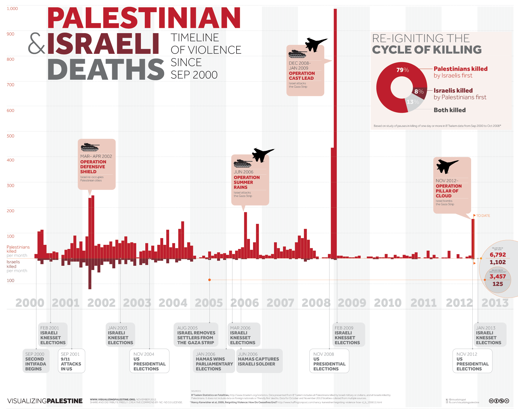
This infographic reflects the death toll and peaks of armed force in the Israel-Palestinian conflict. It draws on detailed data gathered by Israeli human rights organisation B`Tselem since the outbreak of the Second Intifada in September 2000.
The chart also includes figures from a previous study on the peaks of armed force and ensuing death tolls. The chart is particularly pertinent as a new and tenuous ceasefire has halted Israel`s most recent military campaign, Operation Pillar of Cloud, which left more than 150 Palestinians and five Israelis dead.
Of course this timeline is an ahistorical snapshot of a settler-colonial conflict that stretches back six decades. Still, it demonstrates a stark assymetry in the use of force even over this shorter twelve-year period.
[Download full-size image here.]

[Image originally published by Visualizing Palestine.]
![[Crop of infographic below. Image by Visualizing Palestine.]](https://kms.jadaliyya.com/Images/357x383xo/ScreenShot2012-11-26at10.32.13AM.png)


